Overview
PayPal Credit (PPC) is a digital revolving line of credit that PayPal account holder can apply for.

Problem statement
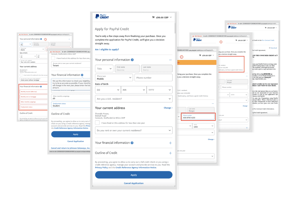
The application form is not optimized for mobile devices, featuring an outdated UI and densely packed product information, which is problematic given that 85% of applications come from mobile platforms.
Fewer customers finish the PayPay Credit application, dropping at a rate of -2.5% each of the past two years.
Project Goal
The team aimed to modernize the existing application, focus was on increasing overall comprehension and confidence when applying for credit which would lead to less drop-offs and increase conversion. Additionally we had to work with the legal team to make sure that the application is compliant with new UK regulation rules.
Success Metrics
2% increase in funnel rate completion
2% increaser in E-sign rate completion
Our approach
Collaborating with my design, research, and product partners helped me refine the problem and influence our approach.

Design
We benchmarked benchmark existing credit products in the UK to identify:
market trends and consumer preferences
gaps in current offerings UI patterns and interaction.
All with the aim of providing actionable insights for developing more attractive and competitive credit solutions.
Initial concepts
After conducting several design workshops that brought together various stakeholders and encouraged creative brainstorming, we settled on four distinct concepts for the application.
Research
The goal for the research was to evaluate 4 design concepts and get user feedback on the look and feel, trustworthiness, and ease of use. Identify the concepts that resonate more with users and narrow down to a select few for further development and refinement.
Research method
Unmoderated concept testing with existing PayPal users in UK who have never applied or user PayPal Credit before but have at least one credit card.
Research findings and recomendations
Some of the key takeaways and overacting themes were:
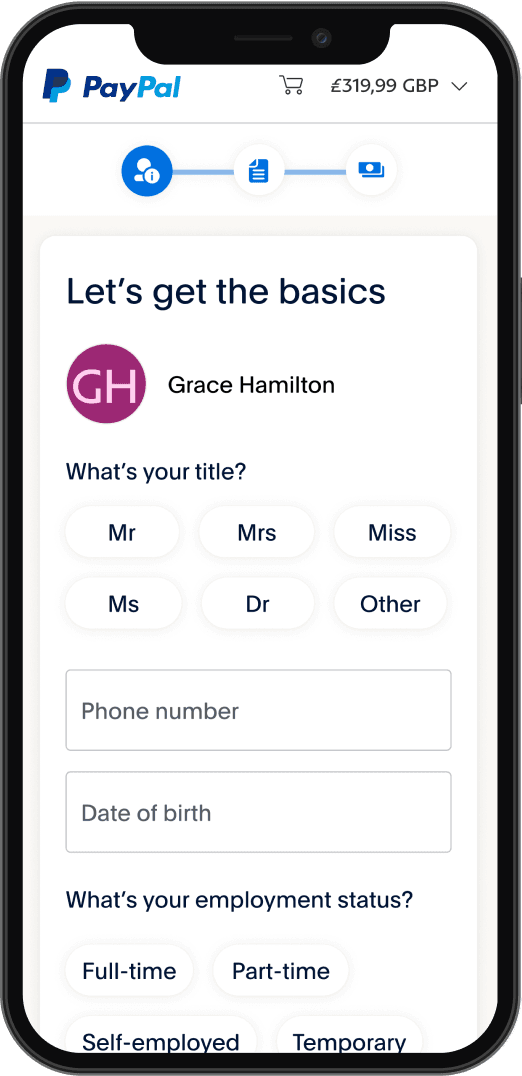
Some concepts were perceived as to informal, juvenile and not as mature as they would expect credit application to look
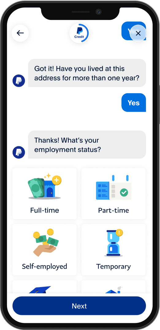
Presence of a progress bar was immediately noticed and much appreciated
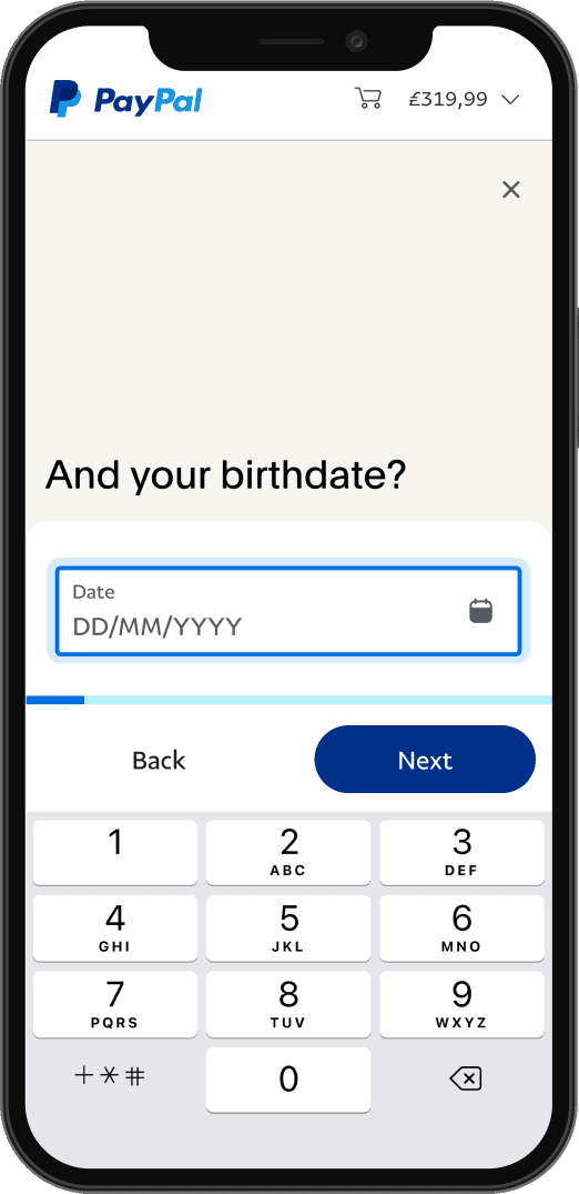
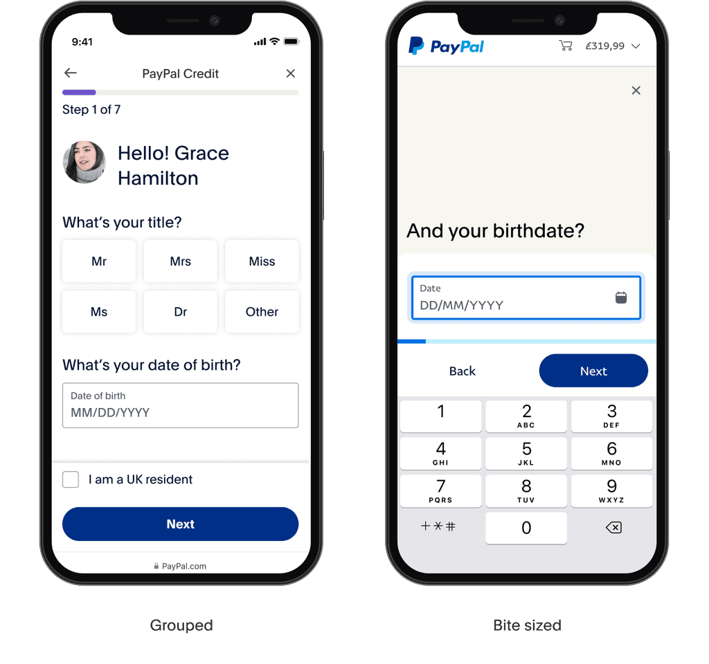
Separating the information in smaller chunks was easier to comprehend
What was next?
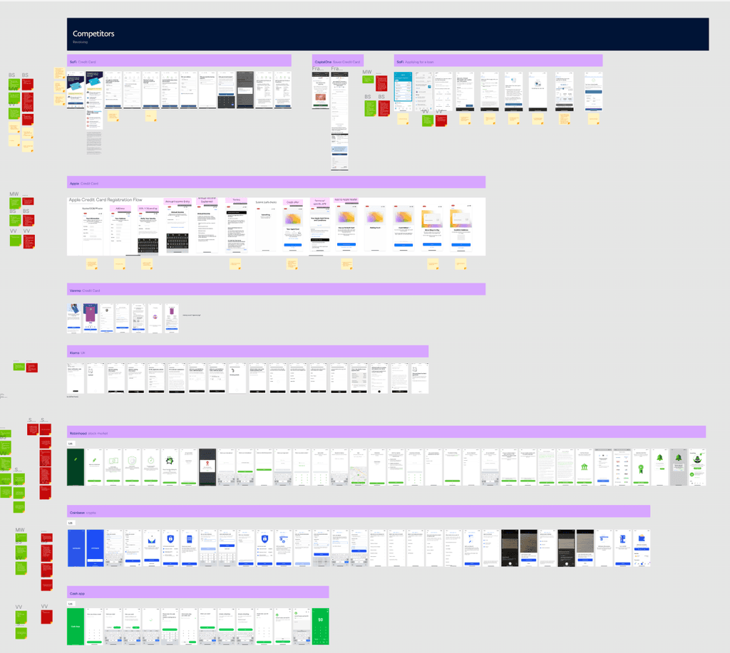
The design was narrowed down to “Grouped” and “Bite-sized” approach, moving away from excessive illustrations and colors in favor of a more mature look that resonated better with our users. We then moved into a second round of usability testing with these two approaches.
Usability testing: Round two
What worked
Out of the two designs grouped layout was perceived as faster, efficient, friendlier and had a seriousness of a credit application
There was no mayor comprehension issues
Forms were easy to use and navigate
Awareness and discoverability of PayPal Credit did not appear to be of concern
What needed improvements
Important information was expected earlier in the flow
Value prop was not immediately obvious
Final designs
Following the completion of our research, it became evident that a grouped approach is the clear winner. With this strategy established, I focused on further refining the user flow and enhancing the user interface.
Happy path
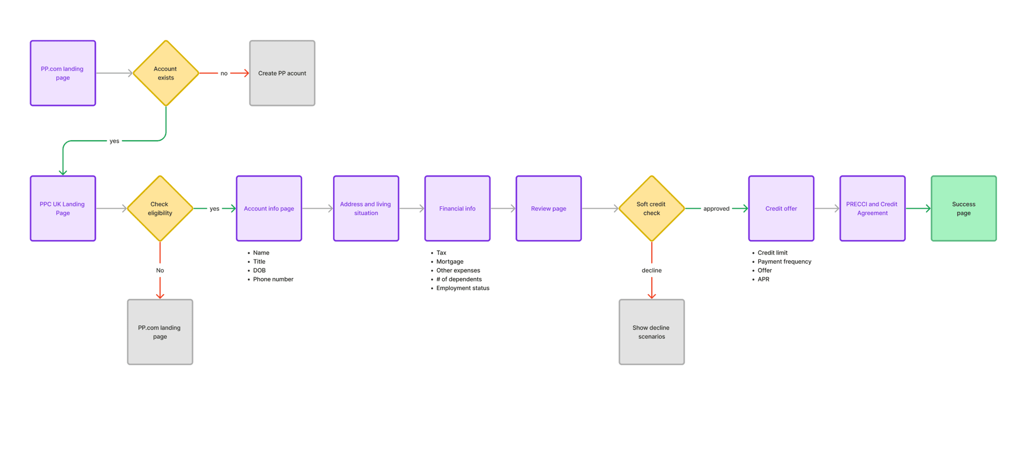
There are a couple of entry points into the PPC UK acquisition flow
Marketing landing page
App engagement card
Web engagement card
eBay direct app
Email campaigns
PayPal Checkout
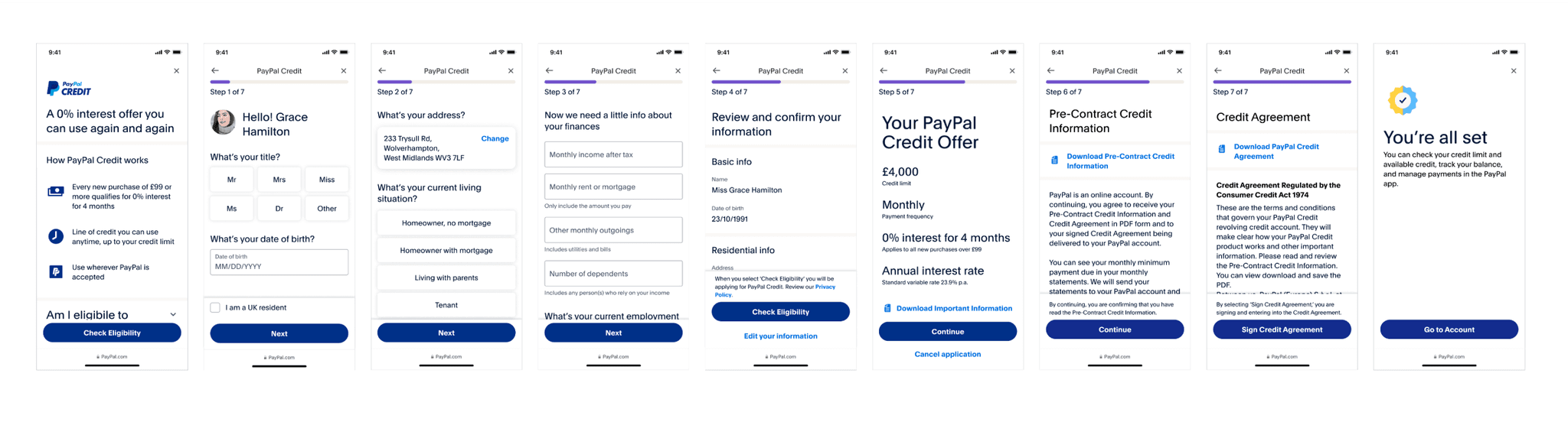
The chart highlights the happy path flow from the marketing landing page
Updated UI and user flow
To address user concerns identified in the research sessions, I took the following steps:
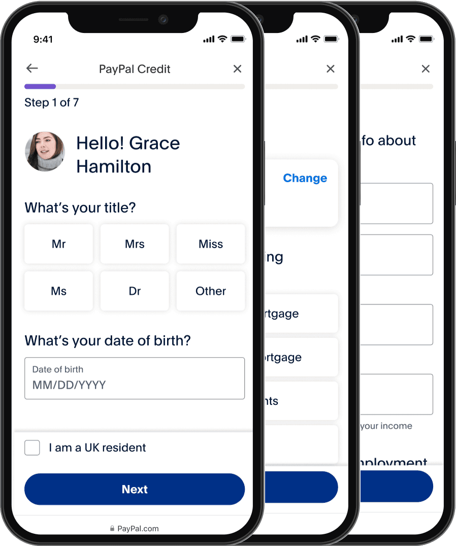
Created a landing page with revised content (Shoutout to Ashlyn Keefe best content writer I worked with)
Added a review page before checking eligibility to summarize the information from the form fields

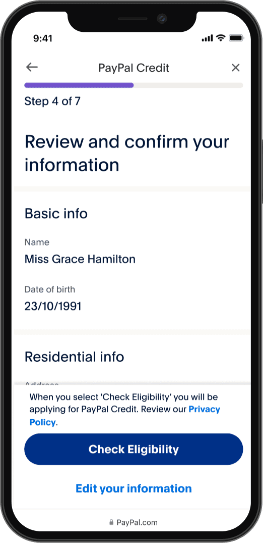
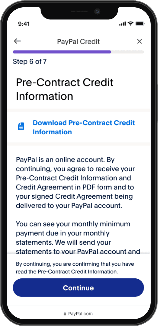
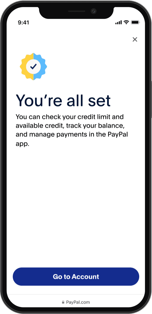
Full happy path user flow

Challenges and problems
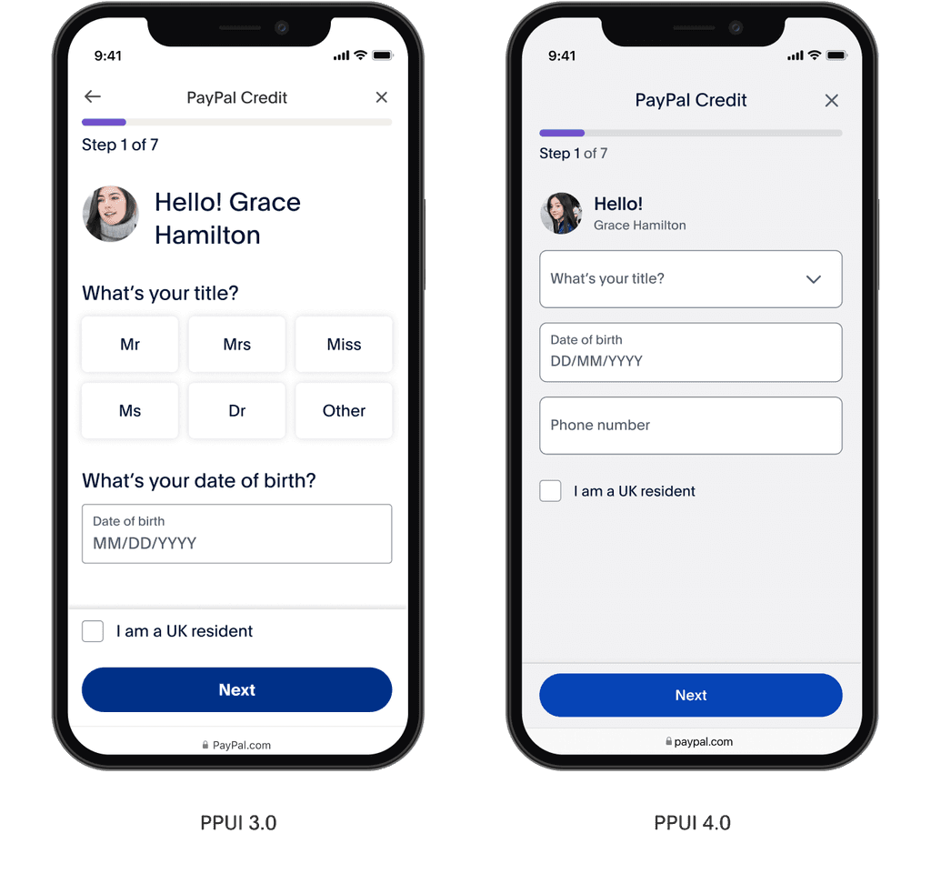
The company decided to do a rebranding before project was complete
PPUI switched the design library from 3.0 to 4.0
Aligning multiple products across different international markets with with specific set of legal requirements
PayPal Checkout went to a design update, and since that is one of the main acquisition entry points I had to collaborate with the checkout team to make the necessary adjustments
Project was deprioritized a couple of times which led to a prolonged timeline for release
Conclusion
Despite facing significant challenges, including a company-wide rebranding, a shift to a new design library, and the complexities of aligning products across international markets, the project demonstrated remarkable adaptability. Collaborating with the PayPal Checkout team ensured seamless adjustments to one of our main acquisition entry points. However, repeated deprioritization led to an extended timeline for the final release.
What did I learn?
From this project, I learned the critical importance of adaptability and collaboration in user experience design, especially in fast-evolving environments. Navigating challenges like rebranding, changing design libraries, and aligning with international legal standards reinforced the need for flexibility in our approach. I also understood the immense value of early and consistent collaboration with cross-functional teams, particularly legal and checkout, to ensure regulatory compliance and seamless user journeys.
Furthermore, the usability testing and user feedback sessions highlighted the significance of involving real users throughout the design process to validate concepts and guide refinements.